All work
Case study · Astro
Hypnotherapy — Design Directions
Three landing page directions for one hypnotherapy practice. Each one is a full page, and a short note compares them and recommends one.
Visit the live site 7vred7.github.io
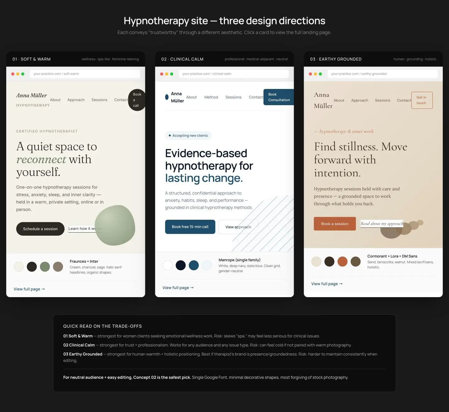
Scroll inside the frame to see the whole home page · captured 17 October 2026
At a glance
- 3 full landing pages
- 3 font pairings
- 12 palette colours
- 1 recommendation, with the trade-offs
On the site
- 01 Soft & Warm: Fraunces and Inter; cream, charcoal and sage; italic serif headlines and organic shapes.
- 02 Clinical Calm: Manrope alone; white, deep navy and slate blue; a clean, gender-neutral grid.
- 03 Earthy Grounded: Cormorant, Lora and DM Sans; sand, terracotta and walnut.
- A trade-offs note: for a neutral audience and easy editing, direction 02 is the safest pick.
- Built with Astro and deployed on GitHub Pages.